Dashboard filtration
and data management on CHEQ platform
My role
Senior Product Designer
Duration
2 months
Team
2 Product Designers
3 Product Managers
2 Analytics
6+ Developers


The Go-to-Market
Security Platform.
Overview
CHEQ is the Go-to-MarketSecurity Platform, dedicate to secure data and analytics, on-site conversion and paid marketing from bots, fake traffic and malicious users.
2016
Company
Founded
$128.9M
2023 Revenue
30.59%
YOY
$182M
Funding
15.000
Customers
CompanyMission
01.
Detect invalid activity affecting marketing efforts and the site.
02.
Eliminate bad traffic from pipelines and funnels.
03.
Present granular analytics and actionable IVT insights.
04.
Proactively protect customers' data.
What I did
As a Senior Product Designer, I went from the initial acquaintance with stakeholders to the final development and testing of the project. I participated in all processes of working on the project, including:
-
Validating stakeholder visions of opportunities within timeframes and technical constraints.
-
Conducted user research and interviews
-
Forming the stages of work, the primary structure of the project, and estimating it in terms of human-time, work hours, and development order.
-
Creating a design system on the basis of which this project was developed. Learn more about the design system here.
-
Conducting design sprints to solve non-trivial tasks.
-
Conducting user testing and brainstorming sessions with team members.
Problem
Statement
The filtering and date management system on each of the four Platform Solutions were cumbersome, complex, and confusing, with the number of bugs being simply legendary.
-
Due to the design of the filter and the Insights window, the platform simply fell apart when attempting to open it on a screen resolution lower than 1920.
-
Multi-level lists in a large window that dropped down in the middle made it inconvenient and ineffective for users, leading them to communicate with support more frequently or to completely avoid using the Platform to collect statistics for their advertising campaigns.
-
A confusing filtering and delivery management system led to users misunderstanding the received information as a whole, resulting in incorrect budget settings (or losing them altogether), ultimately leading to clients leaving.

Previous view


Workflow
Discover

User Interviews
User Research
Competitive Analysis
Define
Personas
Empathy Map
Journey Map
Ideate
User Flow
Card Sorting
Information Architecture
Design
Wireframes
Prototype
UI Design
Test
Feedback
Conclusion
Usability Testing
Data Extraction
The process of our work entails more than simply revising the existing solution; it involves conceptualizing the journey from the beginning and determining what we can feasibly implement while finding a compromise.
Hence, I documented the essential data we required initially:
-
The workflow we will be utilizing.
-
The structure of the dashboard to be preserved.
-
Pages and features that will need to be maintained.
To facilitate communication with stakeholders, I created the current sitemap and identified pages that are likely in need for filters re-design

User Interviews
Despite the customer's research efforts, we conducted additional studies to fill in any gaps in data. My objective was to delve into users' fundamental needs, identify pain points in their product interaction, understand the context of these issues, and devise effective solutions. Additionally, I evaluated their core values, emotional states, aspirations, and individual objectives.
Personas

Jessica Miller
Occupation: Marketing Leader
Experience Level: Advanced
Marketing Strategy: Strategic Planner
Age: 42
Primary Goals: Driving brand awareness, increasing lead generation
Challenges: Balancing multiple campaigns, analyzing ROI effectively
Preferred Device: Laptop
Technical Proficiency: Proficient
Preferred Features: Advanced analytics, campaign optimization tools
In the UX flow, Jessica would be looking to:
-
Comprehensive Data Insights: Access detailed analytics on campaign performance, audience demographics, and channel effectiveness to make data-driven decisions.
-
Actionable Recommendations: Receive tailored recommendations and insights based on AI-powered analytics to optimize marketing strategies and improve ROI.
-
Seamless Collaboration: Collaborate with team members and stakeholders by easily sharing reports, insights, and campaign updates within the platform.
The UX flow should cater to Jessica's needs, providing her with the tools and insights necessary to drive successful marketing campaigns and achieve her strategic objectives efficiently.
Empathy Map
Says:
-
"I need to optimize our advertising efforts for better ROI."
-
"Understanding data trends and patterns is essential for strategic planning."
-
"Our branding and messaging need to resonate with customers."
-
"Analyzing campaign performance data is time-consuming and overwhelming."
Does:
-
Manages paid advertising campaigns across various platforms.
-
Oversees data collection, storage, and analysis processes.
-
Develops and executes marketing campaigns across multiple channels.
-
Utilizes business intelligence tools to generate reports and dashboards.
Thinks:
-
"How can I improve ad targeting and reach the right audience?"
-
"Are our marketing campaigns effectively driving engagement and conversions?"
-
"How can I ensure our data is clean, reliable, and consistent?"
-
"What metrics should I prioritize to measure marketing and advertising success?"
Feels:
-
Pressure to demonstrate the ROI of advertising and marketing efforts.
-
Concerned about data integrity, privacy, and security.
-
Determined to enhance brand awareness, customer engagement, and conversions.
-
Frustrated by underperforming campaigns and overwhelming data analysis tasks.
Research analysis
Stakeholders have their own needs and motivations:
-
They are not prepared to overhaul the platform and develop a new product from scratch, but they would welcome a straightforward redesign of the system.
-
They are under time pressure to meet deadlines for the next round of investment.
-
They intend to showcase the product as a new standard and model for other projects. They desire the product to embody the overarching concept that CHEQ is a company at the forefront of advanced technologies.
There are technical constraints
-
The data loading system has a complex structure and cannot be changed at the moment.
-
Dashboards are information-rich pages, each with a hierarchical structure (the most crucial graphs are located at the top).
-
We can consolidate all the necessary panels into a single window, but only at resolutions higher than 1920.
The user experiences significant pain:
-
Users find it challenging to navigate the system. They struggle to discern the source of the chase and the order and levels of filtering.
-
Users express confusion about the structure, questioning why the referrer appears in the Keywords section and the distinction between custom and default views.
-
Users often miss crucial information in search results and misinterpret the data.
GTBD

Practical
Navigational cleanliness and simplicity

Emotional
More happiness and less stress :)
Technical

The system's capability to function properly across all modern computer resolutions.
First design
sprint
During the first sprint, we discussed the project objectives, conditions set by stakeholders, current processes, system structure, and technical limitations.
The Mid Designer provided a brief report on the outcomes of the user research, while the Technical Lead presented findings on the capabilities of the navigation and filtering system.
Based on the sprint results, we identified the following "How could we" objectives:
-
Provide a clear understanding of technical capabilities to enhance the system.
-
Explore and suggest options for structural changes in navigation, focusing on improvements rather than overhauling the system.
-
Enable quick access to the necessary charts in the preferred sequence for users.
Following brainstorming and prototyping sessions, we selected several interface solutions, for which I subsequently developed a design system. The outcome is the UI concept.


Visual
concept
The visual modification, rebranding, and renaming of the platform were intertwined with political considerations, particularly with the ambitious plan to go public and generate revenue by acquiring two smaller companies and integrating their development into the existing platform. Therefore, the adoption of a new component library was associated with this project but was not solely a part of it. (Filtering and navigation served as pervasive components, and due to the technical structure of the system, it was easiest to update them based on the new system.)


Drafts & attempts
During brainstorming sessions and whiteboard sketching, we concluded that in our specific scenario, filtering is inherently intertwined with navigation. This is due to the unique structure of our platform and the fact that there is no generic user flow where users seek general information. Instead, their queries always pertain to specific campaigns, countries, time frames, or other specific parameters. Therefore, our primary navigational solution was to integrate filtering directly into navigation, essentially creating a unified control panel for data management (like a remote control)
As a first step, after redesigning the old page, we attempted to retain the filters in their previous horizontal layout but reconsidered their structure. However, this approach did not yield significant improvements due to the number of fields being used.


Final option and component


Solving the
practical job
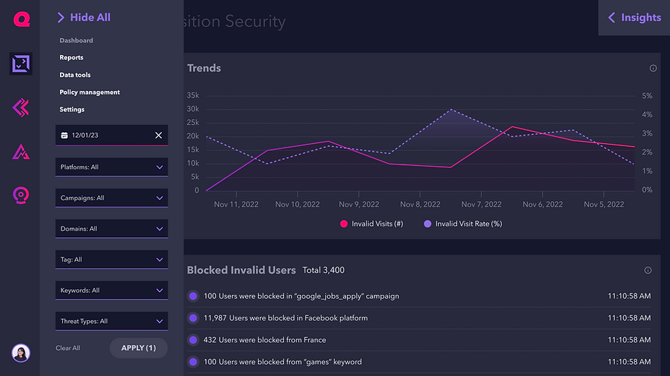
After the concept was approved, we initiated changes to the functionality and UI, addressing practical GTBD. To achieve this, we commenced with experiments and suggested incorporating visualization of filter nesting directly into the menu, transforming them into a sort of control panel for the entire dataset


Solving the
emotional job
The simplicity, elegance, and intuitiveness of having all control sources in one place cannot be overstated. The user's task completion rate increased by 57%, and the number of enthusiastic reviews for the new positive and easy visual scheme exceeded our wildest expectations. We helped users quickly understand and remember the platform's user pattern, as it extends throughout the entire platform, and provided easy access to correcting desired sections of the search results.


Solving the
technical job
Using responsive design and nested levels, along with very clear breakpoint design, we ensured that the screen looked great even at 1280-pixel resolution.


User testing
User testing took most of our time. We were interested in usability metrics, such as the achievement of the expected result and speed, number of mistakes, and subjective index of satisfaction.
Two key aspects became integral to the data collection process:
-
The system was initially adept at gathering metrics for each user, including click-through rates, session durations, and most importantly, the number of reports reviewed and screens generated post-filtering/selection.
-
Communication with the Kasatomer support. Due to the product's nature, we maintained close contact with client representatives, resulting in rich and positive feedback loops.

Results
in 2 month
Within two months, we observed improvements in metrics available in a technical way and also learned statistics from the analytics team and customer success.
37%
reduction in customer support tickets related to usability issues.
19%
Increase in the average session duration
42%
increase in the number of reports generated.
30%
increase in customer retention
Learnings
-
Components in navigation and design sometimes need to be arranged according to the specific audience and situation, rather than following "best practices" and other conventions.
-
Clarity in understanding and managing information is crucial for this audience; unclear or poorly managed data can often be equated to the absence of data altogether.
-
Implementing a new library can start from any process within the company; it's essential for it to be ready for such scalability.