Exploring engineering performance — from patterns to evidence
My role
Senior Product Designer
End-to-end design
Duration
4 months
Team
2 Product Managers
1 Analytics Specialist
6+ Developers

AI Analytics
![89363-[Converted]-.png](https://static.wixstatic.com/media/00dc03_a25b41355d1548a4aba02bb6a7344e68~mv2.png/v1/fill/w_1110,h_698,al_c,q_90,usm_0.66_1.00_0.01,enc_avif,quality_auto/89363-%5BConverted%5D-.png)
Overview
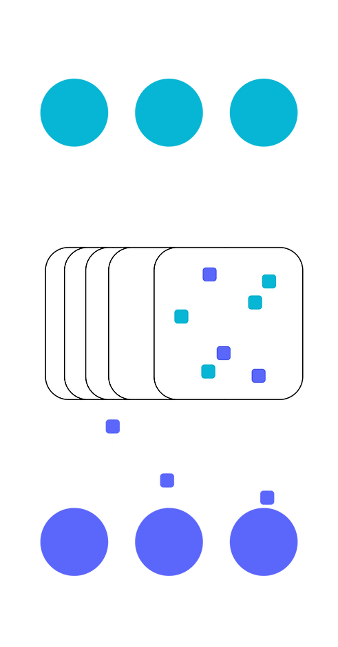
Metrics was the primary analytical workspace in LinearB
— and the most visited page on the platform by a significant margin.
It was also one of the oldest and most difficult parts of the product to evolve.
Years of accumulated functionality had created a rigid reporting structure, confusing navigation between reports, an increasingly complex filtering model, and significant frontend legacy debt.. Even relatively small changes carried disproportionate implementation risk.
The rapid expansion of AI data finally pushed the existing model beyond its limits.
Adding AI wasn't just adding another metric. It introduced entirely new dimensions — AI tools, coding assistants, coding agents, AI review activity and attribution — that users needed to combine with teams, developers, repositories and existing engineering metrics.
The challenge
How could we make a highly dimensional engineering dataset explorable without making the interface exponentially more complex?
At a glance
#1
most visited page on the platform
40%
of engaged AI Insights accounts drilled down into the existing Metrics experience
100+
possible analytical combinations supported through one interaction model.
The legacy problem
The product had outgrown its reporting model
The existing Metrics experience had been built incrementally over years.
Every new metric, report or data source added another layer to an architecture that had never been designed for this level of dimensionality.
Three problems had become especially visible.
Growing dimensionality
Engineering data could already be segmented by organization, team, developer, repository and multiple workflow dimensions.
AI introduced several more.
Simply adding another “AI Tools” filter would technically expose the data — but make an already overloaded interaction model even harder to understand.
Fragmented navigation
Different analytical questions lived across different reports, with inconsistent ways to move between them or preserve context.
Users often had to reconstruct the same analytical setup when switching questions.
Technical legacy
The frontend had accumulated enough complexity that even seemingly small changes became expensive and risky to implement.
The UX problem and the engineering problem had become the same problem: the system wasn't scaling.
What triggered the redesign
AI didn't create the problem.
It made an existing problem impossible to ignore.
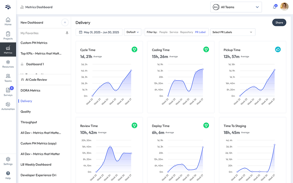
Reframing
analytical model
Filters weren't the problem. Different questions were being treated as the same thing.
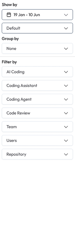
Instead of redesigning individual reports one by one, I stepped back and separated the analytical experience into three fundamentally different user decisions.
SHOW BY
What do I want to analyze?
The analytical question or report — for example AI Adoption or another engineering performance view.
GROUP BY
What do I want to compare?
Teams, AI tools, repositories, users or another dimension.
FILTER BY
Which part of the dataset matters to me?
Narrow the analysis by team, user, AI coding activity, coding assistant, code review, coding agent or repository.
A user could now construct a question such as:
Show me AI Adoption, compare it by AI Tool,
only for these teams and repositories.
instead of navigating to a pre-built report for every possible combination.
The key shift
From: Reports containing their own filters and logic
To: One shared analytical model capable of generating many different views of the same underlying data.
The interface became less like a collection of dashboards and more like a visual query builder.
Combinatorial complexity
The happy path was the easy part
A clean default dashboard wasn't difficult to design.
The real challenge appeared when users started combining dimensions.
The system had to remain understandable with:
0 → Many filters
No grouping → Multiple comparison groups
1 → 10+ selected entities
Short → Very long names
Complete → Partially unavailable data
Valid → Conflicting filter combinations
So I designed the filtering and grouping system as a reusable interaction framework rather than a collection of report-specific controls.
Selections could expand progressively, collapse when they became too long, expose selected entities without hiding the active query, and clearly communicate when data was unavailable because of filtering or missing integrations.
One model, many states
The same framework had to work whether the user was comparing:
2 AI tools
10 engineering teams
multiple repositories
or looking at the organization as a whole.
The goal wasn't to remove complexity from the data. It was to prevent that complexity from leaking into the interaction.


Visualization layer
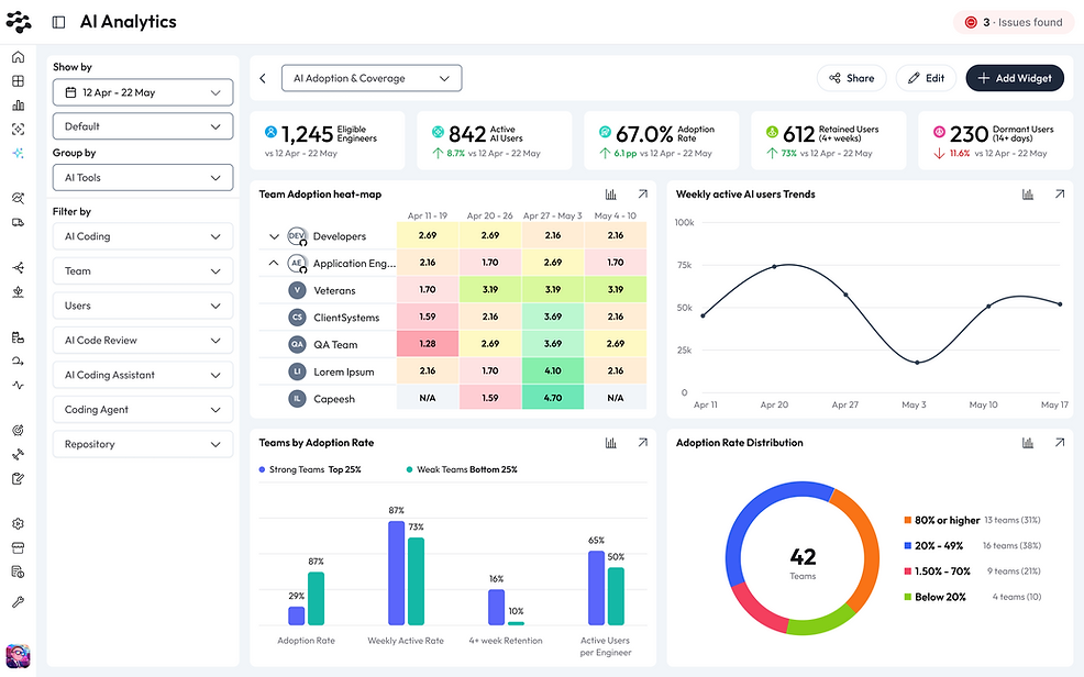
I deliberately didn't start by redesigning every chart
During the first phase, the charts remained intentionally simple and reusable.
That was a product decision.
At this point, the biggest uncertainty wasn't how to visualize an individual metric. It was whether one interaction model could support very different analytical questions without forcing users into a new report every time.
So I prioritized the architecture underneath the charts:
What are you analyzing?
What are you comparing?
What data are you including?
Once those three decisions were explicit, the same visualization could respond to radically different queries.
One chart, different questions
No grouping
What is happening overall?
Group by Teams
Which teams behave differently?
Group by AI Tools
Which tools are driving the difference?
Filter further
Is the pattern still present for a specific population or repository?
The charts were intentionally flexible.
The analytical model was the product architecture.


Drill-down
Every number needed a path back to evidence
Filtering and grouping helped users find patterns.
But identifying a pattern wasn't enough.
A user looking at a spike in Code Changes might immediately want to know:
Which PRs created it?
Who initiated them?
Which AI tools were involved?
Which commits contributed to a particular PR?
How confident are we in the AI attribution?
So I designed drill-down as a continuous interaction rather than another report.
The investigation flow
From aggregation to raw evidence
Analytics helped users form a hypothesis.
Drill-down let them verify it.
01
Spot a pattern
A user notices an unusual point or distribution in a chart.
02
Isolate the signal
Selecting a specific state (for example, Initiated PRs) immediately filters the underlying dataset.
03
Inspect the entities
The chart expands into the PRs responsible for that data point, including repository, PR size, author, AI tools and status.
04
Go one level deeper
A PR can be expanded into its individual commits, including AI attribution and confidence.
05
Reach the source
The user can open the original PR or commit and verify the underlying engineering activity directly.
Metric →
Data point →
PR →
Commit →
Source
One framework, different questions
Built to evolve
The new analytics framework wasn't tied to a fixed set of charts. Once navigation, filtering, grouping and drill-down became shared patterns, individual reports could evolve independently — without rebuilding the experience around them.
Next iteration concept
The same framework can support more purpose-built reports, with visualizations designed around a specific analytical question while keeping the interaction model consistent.
The framework stays consistent. The visualization adapts to the question.
The result
What started as a redesign of a legacy Metrics dashboard became a foundation for a more scalable analytics platform:
one analytical model
→ supporting 100+ possible analytical combinations
→ with continuous drill-down to source data
→ and room for purpose-built reports without fragmenting the experience.
Instead of adding AI to a legacy dashboard, we redesigned the system so the next dimension wouldn't require another redesign.